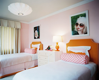
Since I have so many wonderful photos of Baby A I decided to blow 2 of them up after I saw this adorable and bright child's bedroom. The photos above the beds are so stinkin' cute and it gave me the inspiration to do the same with Baby A's pics.
 |
| Via Lonny Mag |
I bought 2 black frames from Michaels when they were on sale and ended up spending less that $15 on each of them.
I hung them on top of one another in the hallway between our laundry room and guest bath. The space was so boring and white so the prints added color to the once dull space. Her's what the space looks like after purchasing a chest, lamp, and accessories from Home Goods.
 |
| Ignore the glare please. Bad lighting in the hall. |
Not only could I just have the 2 humongous prints of Baby A, but I went ahead and added another in the zebra frame on the chest so everyone that comes over to my house positively knows who's boss around here! And that's why I call it Baby A's corner.
Do you like my over obsessed corner?!
*Linked up at Sugar Bee Crafts, Todays Creative blog


I love your over obsessed corner!! And actually I don't think you're over obsessed at all- our kids are our whole world, so our houses should show that! :)
ReplyDeleteI love the pictures blown up so big. I want to do that too with my favorite baby pictures of my kids. I love this whole area that you created. It looks beautiful and makes a spot that most people would completely neglect into a space that's pretty AND functional.
AWESOME! I love your blog! i am your newest follower. i would love it if you would stop by and become mine! have a great day!
ReplyDeleteKirsten